


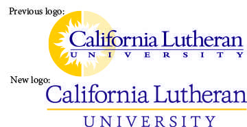
After two years of research and design, California Lutheran University’s logo was officially changed on Aug. 29. The sunburst was put to rest and in its place is a purely typographical logo.
The hope is that this new logo will give Cal Lutheran a more modern image and align more closely to the Cal Lutheran brand promise: for students to discover and follow their purpose.
In 2012, the board of regents questioned as to whether the logo of the sunburst adequately represented the new brand promise for students. Christie Harper, assistant vice president of University Marketing, and leader of the project to change the logo, said that it soon became apparent that the sunburst did not hold up to the motto or to other university’s logos.
“The typography was very thin, so if you put it on a billboard it disappeared,” Harper said, “and if you held it up to competitor logos, it faded into the background.” She said that the symbol of the sunburst was difficult to work with from a production standpoint because the logo was so complicated.
At first, Harper and her team explored other symbols like mountains, hills, waves and the Luther rose. When these symbols fell flat, they considered a purely typographical logo.
“One of the reasons that we looked this direction was that it didn’t tie us to a particular symbol but allowed us to be broader in what we were communicating about the university. It works whether you’re talking about art or science,” Harper said.
The typography of the new logo has two different type settings. The first is a casual font that is used for “California Lutheran.” The second is a formal font that is used for “University.” These two fonts are meant to highlight Cal Lutheran’s dual nature. “It communicates both sides of Cal Lutheran: informal, casual, welcoming, friendly, and prestigious,” Harper said.
The process of changing the logo was aided by focus groups of staff and students. Overall, the people in the focus groups liked the new logo, “equal to or better than the sunburst,” Harper said.
“I don’t understand why you would want to change it,” sophomore Kylie Clark said. To Clark, the sunburst represented a place where you find who you are. “You find your shine, you find your light,” Clark said. Overall, Clark missed the sunburst, but acknowledged that the new logo was a better representation for the university. “It’s better because it’s more clean cut,” Clark said.
Ally Ruggles, president of Associated Students of Cal Lutheran Government, agreed that the new logo is an improvement. “Students liked the look of the sunburst, but didn’t understand the reason for it,” Ruggles said. “Now the new logo is simple but it’s prestigious.”
Ruggles said that, like Clark, she also misses the sunburst. “Things change and when things change there’s always a place in your heart where you think things are missing,” Ruggles said. “But things are going to keep moving forward and only in a positive direction.”
Julie Griffin
Staff Writer
Published on September 17, 2014