


California Lutheran University has chosen a permanent ‘spirit mark’ to represent the Athletics Department which has rallied up controversial conversations, rumors, petitions and trending hashtags on Twitter such as #Where’sTheU.
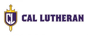
Assistant Vice President for University Marketing Christie Harper said, the University budgeted $100,000 in creating the new athletics spirit mark. The spirit mark’s webpage introduces the chosen logo as, “our athletes and students proudly displayed a distinct insignia: a shield embellished with Cal Lutheran’s initials.” Though the website portrays favor of the new mark, athletes and students have voiced their opinions otherwise.
“The logo has an aesthetic issue I don’t like. It’s the U that’s dropped and the design itself. The common complaint you hear is it looks lopsided and I agree there is a purple space right in the middle of the logo that looks out of place that makes it graphically not pleasing,” said senior basketball player Reagan Chapman who is also a third year member and co-president of Student-Athlete Advisory Committee (SAAC), which was involved in the process of choosing the logo.
The complaint most commonly heard among the student athletes and conversations that have been spurred on social media is that the U has been dropped from the mark and only incorporates the C and the L.
“Well I wouldn’t say the U is dropped because it’s never been there. There has never been a U in the main athletics logo. People think we have dropped it but in reality it has never been there in the beginning,” Harper said.
The full CLU has and is still present around campus. In fact, items that are branded with CLU, to show representation of CLU, such as hats, sweaters, t-shirts, backpacks, even socks are sold at the University’s campus store.
Harper said the mission of creating a new athletics logo began in 2011. The University was looking to go away from the temporary word mark to more of a gender-neutral symbol.
Harper said the process that took place involved four members of the design team, four coaches, eight student athletes, members of student government and staff and administration who were known as the Core Team. The Core Team was given three different designs to choose from. The options were very close in favor but overall the chosen one had a slight preference.
“We chose this one because we felt like it respected the tradition and brought it forward into the modern era, where the other one didn’t have a shield so it didn’t have much of a connection to our traditions,” Harper said.
Chapman had a different view when it came to the process of choosing the symbol. He said that the entirety of the student athletes and coaches involved were not in favor of losing the U in CLU.
“The U is necessary because it is really important to keep the idea of the university tied in with our athletics department because that is what DIII athletics is about. It is a part of the DIII mission statement. It’s about athletes who want to pursue their sport but also have an interest in high levels of academics, so it’s important to keep it because it really instills that we are a university in that academic realm,” Chapman said.
Harper said the argument for not incorporating the U within the logo was because the university is most commonly known as Cal Lutheran. Outsiders call the University Cal Lutheran so it was important for them to accurately depict what nickname is used most when talking about the University.
“It’s more jarring because people expected when you see initials that you’re going to see three, so it’s one thing when you write out Cal Lutheran, it’s another to just do CL and that’s the new part,” President Chris Kimball said.
There is an active Clear Lake University trademark, according to the United States Patton and Trademark Office, therefore a factor in dismissing the U in the spirit mark. Clear Lake University owns the trademark of CLU, so CLU has never been California Lutheran University’s trademark to begin with. Harper said in an email interview that the use of the three letters on items sold at the university could be in violation of their trademark but they have not enforced it. If Clear Lake University chose to object the use of Cal Lutheran’s use of the CLU, the university would legally have to comply.
According to Chapman SAAC was never informed of this information during discussions about the spirit mark choice.
“This doesn’t seem as a legitimate reason considering we were never informed of this by the marketing department. Why wouldn’t that be the first thing they told us? People probably would’ve jumped on board,” said Chapman in a follow-up email interview.
Associated Students of California Lutheran University Government Senate Director Brittney Martinez said that after being told the reasoning for not including the U she understood it from a marketing perspective. Not many items sold from the university use CLU it mostly is Cal Lutheran and that is the name most commonly used, although the Athletics Department felt differently.
“When we stated our opinions in wanting the U, I wouldn’t say we were unheard, but their response was that the choice to take away the U had already been made and we were going forward without it. That was the way it felt,” Chapman said.
Harper said the decision to not incorporate the U was decided three years ago and the current spirit mark is here to stay at least 10 to 20 years.
“It conveys the characteristics of honor and nobility and character and a little bit of fighting spirit. It shows offense and defense. The sword is offense, the shield is defense so it conveys a lot of the characteristics that we really wanted it to,” Harper said.
With heated discussions a petition has been made by students not in favor of the decision. As of now the petition has over 150 signatures and comments explicitly portraying their disfavor of the spirit mark that has been chosen to represent them as student athletes.
“Overall as a whole I am disappointed. I am disappointed in the process, the sourcing of the logo. I was personally in favor of not having an outside company. The previous logo before our current spirit mark with the helmets was student designed and I think that is a really cool idea that could have been at least attempted and it would have been free. Overall the process took a long time and a lot of money and people are clearly not satisfied,” Chapman said.
Other changes that are in the process are the improvement of the Kingsmen and Regal mascots. Assistant Dean of Students and Director of Student Life Scott Silverman said the vision is to use student input to create new suits with a new design.
“I would love to have student input on this. It is not going to be my mascot, it’s ours, it is essentially your guys’ so I want to know what you all want to see. That is really important to me,” Silverman said.
Silverman plans to begin this process soon. He is now talking with and plans to get students from different organizations such as student government, SAAC, the Purple Pit Club and more to design and help choose the two new mascot costumes. The goal is to produce the costumes, incorporated with the new spirit mark, over the summer and have the costumes be used at events this coming fall semester.
With the changes to the spirit mark coming in the fall semester, the most frequently asked and unanswered question remains, “Where’s the U?”
Maryssa Rillo
Staff Writer